Creating a Rotator Control
Scenario: You want to draw a rotator command control to command and view, for example, the Present Value of an Analog Output data point, using a rotator command control on your graphic.
There are two methods of doing this:
- You can gather object type information for a data point and then draw and configure a customized command symbol or graphical element, such as a button, that allows you to send commands from within a graphic.
- You can drag an existing default command symbol from a project library to a graphic. To add a default command symbol from a project library, proceed directly to Designating and Adding a Default Command Symbol to a Graphic.
Reference:
- For overall background information, see Command Control Configuration.
- For Command Control and Navigation properties background information, see Command Control Properties and Command and Navigation Properties.
- For an overview on the Rotator command control, see Command Control Elements and Symbols.
- For symbols background support when creating command control symbols, see Symbol Property Substitution.
Workflow diagram:
Prerequisites:
- You have reviewed Preparing to Create Controls to Command Objects
- System Manager is in Engineering mode.
Steps:
To draw and configure the Rotator command control, complete the procedures in order:
The following instructions are just one example of how a rotator command can be drawn and used to command from within a graphic.
- You have reviewed or completed the Preparing to Create Controls to Command Objects workflow.
- To create a new command control on your graphic, from the File menu, select New Graphic
 .
.
- From the Home tab, in the Elements group, click Command Control
 .
.
- Draw a command control rectangle on the canvas.
NOTE: The command control object layout and dimensions have no effect on how the command control behaves. The behavior is determined by the command control and Thumb properties.
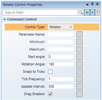
- From the Property View (Command Control Properties), expand the Command Control properties, and from the Control Type drop-down menu, select Rotator.

- To draw the Rotator thumb, from the Elements group, select a drawing or image element to draw or depict a thumb.
- For this example: from the Elements group, click the Polygon
 element and draw a polygon at the top and center of the graphic.
- Expand the Polygon property and in the Node field, type 3, and in the Offset field, type
180.
- For the Thumb (Polygon) to be selectable during runtime, from the Brushes group view, select the Fill
 drop-down menu, and from the color palette, select #FFFFFFFFF (white).
- To configure the center of the Rotator, you must edit the thumb’s properties.
- From the Property View (Polygon Properties), expand the Layout group, and in the Angle center X field, type 50% and then press ENTER. The Angle Center
 displays on the top center of the element. This ensures the thumb rotates correctly around the center.
- To set the radius of your rotation, in the Angle center Y field, for this example, type 250%.
NOTE: With the Angle center X in the middle of the thumb, the Angle center Y is equal to the radius of the rotation. When configuring the Rotator Command Control Properties, many values will depend on the Angle Center coordinates.
- In the Element Tree, press the CTRL key, and select the Rotator element and the Polygon element, and then right-click and from the Group menu that displays, select Join or Leave Command Control.
- In the Element Tree, the Polygon now represents the thumb (child) of the Rotational command control.
- You have created the foundation of your Rotator command control.
Complete the procedure below to configure the Command Control properties of the rotator command control you have drawn on your graphic. The following instructions are just one example of how a Rotator command can be configured.
Scenario: You want to command and view the Present Value of a data point using a Rotator command control on your graphic, and an Analog Output .Present Value data point property is used.
- You have a Rotator command control with a thumb drawn on the active graphic.
- From the Property View (Rotator properties), expand the Command Control properties.

- In the Parameter Name field, type the data point’s Parameter name obtained from the Models and Functions Command Configuration table. This field is case–sensitive. This property will be the same Parameter property later defined in the Command and Navigation section.
- For this example, type Value.
NOTE: This property will be the same Parameter property defined later in the Command and Navigation section.
- In the Minimum field, type the lowest value the rotator will command to.
- For example, type 0.
- In the Maximum field, type the highest value the rotator will command to.
- For this example, type 100.
- In the Start Angle field, type the angle value that represents where the Minimum value starts on the rotator.
- For this example, type –60.
- In the Rotation Angle field, type the value that represents the amount (in degrees) the rotator will rotate from the start angle. The default value is 180.
- For this example, type 120.
- The Snap to Ticks check box allows the Rotator to snap to values in increments provided by the Tick Frequency Property.
- For this example, select the Snap to Ticks check box.
- In the Tick Frequency field, type a value to specify the interval at which ticks are separated on the rotator. The Target’s value (.Present_Value, in our example) changes based on its most recent value and according to the Tick Frequency value.
- Select the Snaps to Ticks check box to enable the thumb to incrementally move to the closest tick when the position of the pointer changes.
- In the Tick Frequency field, enter the value of the tick frequency. For example,10, 20, 30, or 2, 4, 6, and so on. The tick marks start at the Minimum value and continue until the value of the Maximum value is reached.
- For this example, type 10.
- In the Update Interval field, type a value in milliseconds that specifies how quickly the value is updated as the thumb moves along the rotator. The default value is 500.
- For this example, leave the value as the default. The rotator command will update every .5 second as you drag the thumb.
- Select the Drag Shadow check box to view the thumb shadow when the thumb moves. Behind the moving element, the original thumb position is semi-transparent. This allows the actual data point value to always be visible. This property is enabled by default.
- You have configured the Rotator Command Control properties.
The following instructions are just one example of how a rotator command can be drawn and configured for commanding from within a graphic.
Scenario: You want to configure the Command and Navigation properties of a Rotator command control that allows you to command the Present Value of an Analog Ouput data point from within a graphic.

NOTE:
If you create a command control element in a symbol instead of on a graphic, follow the steps below, replacing the target and any other hard-coded references with * substitutions in the Evaluation Editor. For more information, see Symbol Property Substitution.
- You have reviewed the Command and Navigation Properties section and have a full understanding of the fields and the options available to you.
- You have drawn and configured a Rotator command control on the graphic and configured the command control properties.
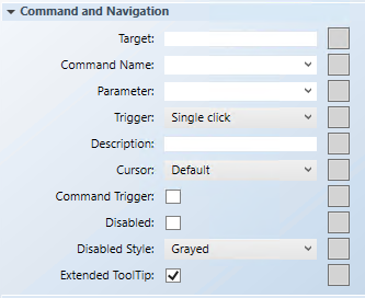
- In the Properties view (Rotator properties), expand the Command and Navigation properties group.

- In the Target field, drag a designated data point from System Browser. If the target designation does not contain a property, the default property is targeted. Otherwise you must specify the property by typing a period (.) and then the property name after you drag the data point into the Target field, for example:
CCProject.LogicalView:Logical.PXRack.B.Block.Hcrv;.Property_Name.
- For this example, drag the Analog Output data point into the Target field. You do not need to type a property at the end of the data point path since Present Value is the default property used.
NOTE: If you have the data point selected in System Browser, or you have selected a symbol instance of the data point on the canvas, the data point information is displayed in the Operations and Extended Operations tab, from there, drag the property you want to target into the Target field. The property name is added automatically.
- From the Command Name drop-down menu, select or type the command rule that you want to apply to the property.
- For this example, type or select Write.
NOTE: The Command Name must match the Name of the command in the Models and Functions Command Configuration section. This field is case-sensitive.
- In the Parameter field, do one of the following:
- Select the value from the drop-down menu.
NOTE: For a stand-alone command control, if you have multiple parameters, only one parameter receives the value from the control itself and all other parameter values must be hard-coded.
- For this example, delete everything but the parameter name, which in this case is: Value.
NOTE: This field must have the same parameter names listed in the Parameter Name field of the Command Control property.
- For rotator controls, commands are sent by moving the Rotator thumb. The Trigger drop-down menu is irrelevant for this control.
- (Optional) In the Description field, type a brief description of the command that will display in the tooltip.
- In the Element Tree view, select the Thumb element of the Rotator, and in the Property View navigate to the Command and Navigation property. From the Cursor drop-down menu, select the cursor preference that you want to display when the command is active. The cursor must be set in the thumb’s element properties, if you want the specified Cursor to appear when it moves over the thumb.
- In the Element Tree view, click the Rotator element and then in the Property View, navigate back to Command and Navigation property and select the Command Trigger check box to enable the command control to send a command.
- (Optional) To disable the command, select the Disabled check box, and from the Disabled Style drop-down menu, select a style.
- For example, if the selected data point is
Out_of_Serviceand the command is disabled, the selected disabled style will be active at runtime to reflect this.
- The Extended Tooltip check box is selected by default. It displays the following command object details: Target, Command Name, and Parameter. If enabled, the extended tooltip is added to any existing tooltips configured for the element.
- Click Save As
 .
.
- To test the rotator command control in Runtime mode, from the Home tab, in the Modes group, select Runtime mode
 .
.
- Do one of the following:
- Create tick marks, proceed to the next topic.
- If you created a symbol and you want to designate it as the default command symbol for an object type proceed to Designating and Adding a Default Command Symbol to a Graphic.
You have created a rotator command control and want to add tick marks and labels to the command control. The procedure below is only one example of how tick marks and labels can be added to a rotator command element.
NOTE: The example below, is based on the example (values) used in the Configuring the Rotator Command Control Properties topic. As you create Lines (tick marks), Text boxes (value labels), and Groups (Line and Text box) for the various points on the rotational angle, it is recommended to add a brief Description in the element’s General properties section.
- To calculate the tick mark angles:
- Multiply the command control Rotation Angle (120, in our example) by the Ticks Frequency (10, in our example).
- Divide the result by the Maximum (100) minus the Minimum (0), In this example, the result is12. This value represents the angle distance between each tick mark.
- To create a Group that represents the tick mark and the text box for the value that is aligned with angle 0. In this case the value is 50.
- From the Elements group, click the Line
 element, and then draw a tick mark directly under the point of your thumb. Make sure the Thumb is at the angle 0 position. If the thumb is not in the angle position, you can reposition the Thumb in runtime mode.
- From the Element group, click Text, and draw a text box directly under the line on the canvas. And from the Format group, click Align Vertically and then click Align Horizontally to center the text.
- In the Properties view (Text Properties) in the Text field, type in the value. In this case, 50.
- From the Element Tree, select the Line and the Text you just created, right-click and from the Group context menu, select Group.
- (Optional) From the Properties view (Group Properties), select General. In the Description field, enter the value 50 Tick Mark.
- In the Properties view (Group Properties), set the Layout > Angle Center X and Angle Center Y so that the Angle Center
 is the same as the center of the rotator. Once you have the Angle Center
  on the canvas you can move it around.
- With the Group still selected in the Element Tree, navigate to the Evaluation Editor and do the following:
- From the Property drop-down menu, select Angle.
- From the Type drop-down menu, select Simple.
- In the Expression field, type 0.
- Repeat Steps 2 through 8 to create the Groups for the value of 0 (the minimum value) and 100 (the maximum value) of the rotator. Note the following difference for the Angle evaluation Value:
- 0 – In the Evaluator Editor, set the Value to -60.
- 100 – In the Evaluator Editor, set the Value to 60.
- To create the tick marks for the values in-between 0, 50, and 100, do the following:
- From the Element Tree, expand a Group, and then select and right-click the Line element. Select Copy and then click the canvas, and then press CTRL+V.
- Drag the Line over the existing tick marks.
- Select Layout > Angle Center X and Angle Center Y and set them to the center of the rotator, as with the Groups.
- In the Evaluation Editor, set the Angle evaluation (Simple) depending on which rotator value you are working on. Note the following difference for the Angle evaluation: Line 10 (Angle = -48); Line 20 (-36); Line 30 (Angle = -24); Line 40 (Angle = -12); Line 60 (Angle = 12); Line 70 (Angle = 24); Line 80 (Angle = 36); Line 90 (Angle = 48).
- Click Save.
- If you created a symbol and you want to designate it as the default command symbol for an object type proceed to Designating and Adding a Default Command Symbol to a Graphic.
